Well this didn’t take long at all, which is surprising. The cover art for the paperback edition of Hurricane Gold was shown off over at the Danger Society though the book isn’t due for release till May of next year. A lot of people seem to like it, however, I am not sold on it. I think it looks nice, but I think they’ve overdone the “gold” thing. The hardcover in gold, that was great. The gold party.. that was strange, but okay. Now it’s paperback time and I was kind of hoping they’d do away with the whole “gold theme” to tell you the truth. Just because it has gold in the title doesn’t mean you have to use an abundance of gold. SilverFin did quite alright not having any actual silver on the cover (though there is a slight silver-esque quality about the eels, but it’s more of a blue), same with Goldfinger and gold and that book had more to do with gold than Hurricane Gold.
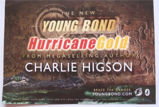
It’s just cover art. Big whoop. I just happened to like the advertisement I saw awhile back better. It’s got sort of an Indiana Jones/archaeological vibe to it, which isn’t bad. The Avenue of Death in Hurricane Gold is actually a lot like the end sequence in The Last Crusade. You know the part where Indy Sr. – Sean Connery – is shot and the baddies force Indy to go through this cave to find the Holy Grail and Indy has to get past all these elaborate obstacles? It’s like that. Anyway here is the advertisement:
Of course, I acknowledge that going with this would have messed up the Young Bond paperback theme, but who really cares. It’s nice to get that similar look in a collection, but it’s not a huge deal. They already started to shift away from that with the Hurricane Gold hardcover anyway and lets not even begin to talk about the inconsistent cover art in America – though I very much enjoy the Kev Walker art for Blood Fever. But look at this advertisement. It’s far more fitting for the story if you ask me. The colors are great. The sandy browns, the murky greens and the croc is more terrifying if you ask me. In the paperback version it looks like a croc out of water with his mouth open. That can be scary, but all of us, if faced with the situation, would rather face off against a croc on land than in water. Right? That’s his domain. It’s like Jaws (that would be the shark). Seeing the shark out of water = you’re a little scared, maybe. Being in the water with the shark = well I bet you taste good. Regardless, there’s something interesting and eerie about how half their head sort of floats on the water.
Speaking of themes and cover art, lets hope they have something really artistic up their sleeves for Devil May Care. I’d love for them to go for a nostalgic Richard Chopping cover, but I have a feeling they’re going to try and cram “Ian Fleming” and “James Bond” on the cover given it’s Fleming’s Centenary. Maybe they’ll surprise us with something really cool. Or something really funky. Remember Colonel Sun‘s first edition? Hey, it’s all fair. Critique my fan artwork that I showed off on this site before. It’s Devil May Care in Chopping’s style, but with a lot ..lot lot lot lot.. etc… less artistic talent.
Related Posts
- Dec.23.09 » Faulks Ranks on Bestsellers of the Decade
- Jun.21.09 » Who Is Up Next For James Bond?
- May.22.09 » Devil May Care Released in Paperback
- Mar.2.09 » Devil May Wow
- Nov.22.08 » Devil May Care US Paperback Revealed
Comments
Comment by zencat
Made Tuesday, October 30, 2007 at 4:26 pm
Well argued, sir…but I still really love this cover.
Comment by Yellow Pinky
Made Wednesday, November 7, 2007 at 8:23 am
Love your design! I’d be thrilled if they actually had the strength of conviction to use a design like that for Devil May Care! Excellent job!


